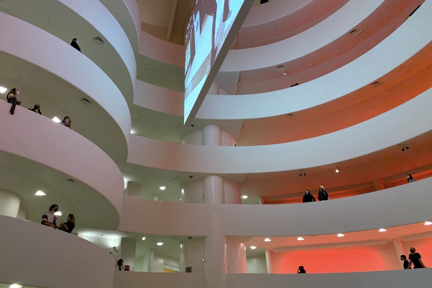
I visited the Guggenheim Museum in New York earlier this week. The museum was more bare than usual due to social distancing policies and a smaller exhibit going on due to the pandemic. There were a few audiovisual works of art displayed in the rotunda, and smaller galleries around the corners of the museum.

Every time I visit a place like this, I’m just as taken by the architecture and interior as by the works of art themselves. What kind of an environment and ambiance is being intentionally created here, so that the visits are led into the right mental environment for the exhibits on display? And then I try to take the aspects of design I notice in these environments and imagine the same principles finding their way into software design.
On this occasion, the quarter mile walk along the spiral walkway up the gallery led me to think about lighting, shadow, and occlusion, and their strange absence in interface design.
Light and shadow
Light and shadow form one of the basics of nearly every other kind of visual design except software interfaces. Almost everything that takes up space in the real world needs to be lit by something, or casts a light on something, or both. So when building something physical, the way the light hits materials and illuminates parts of objects is an intrinsic part of design.
Software mostly lives on a perfectly illuminated, two-dimensional surface, requiring no consideration of light or shadow. Sometimes we borrow metaphors from the real world, like a shade that hides the rest of the page in shadow while an alert or modal dialog box pops over. But most of the time, design of imaginary things on the electronic canvas of a computer screen pays no regard to the intuition humans have about light and shadow.
What would it look like to design software as if it were always “lit” by some light source somewhere? How would this change the way we design interactions with software?
Occlusion
Occlusion is another unavoidable consequence of three dimensional objects that currently has no real place in two dimensional software interfaces. Occlusion refers to the fact that, in three dimensions, something you see is always hiding something behind it. There is always depth, and there is always something in front and something behind.
There are aspects of occlusion used in software design, like a menu drawer expanding to hide the screen behind it, or a window overlapping another window. We’ve carried the metaphor of occlusion to some parts of software design.
In software, though occlusion by and large serves efficiency of space. Interface designers don’t hide things for sake of hiding things – they hide things so they can make space for other things on the screen. In architecture, though, what’s hidden is just as important as what’s visible. Hidden spaces invite exploration, and in a building with as many small nooks and corners as the Guggenheim, the abundance of occlusion invites visitors to move around in the physical space of the building to see further into its design.
There is no such affordance in software design. What’s visible is visible, and what’s hidden is visible some other time. The user stays put, only twiddling their fingers on the screen to move things on top of each other.
How can we be more intentional about what’s visible and what’s hidden in software design, to create spaces that are explorable rather than surfaces that are merely useful?